

Hand UI screenshots to a visual understanding model to pick issues across four dimensions and score them; page errors and images that fail to load can also be located with a screenshot plus code.
Disclaimer: The content shown on this page is generated by an AI model and is for reference only. It does not constitute any guarantee of results. Actual output and Credits consumption are subject to "Usage Details" in the console.
qwen3.7-plus (visual understanding) → feed the UI screenshot + a four-dimension review checklist (color / font / hierarchy / background) → per-item judgment + priority improvements + score.
Actual output
Review run on the first version and the revision of the same "Parents' Medication Manager" page. Submitted materials:
First version (dot-grid background + dark green title bar + multi-color time-slot bar) 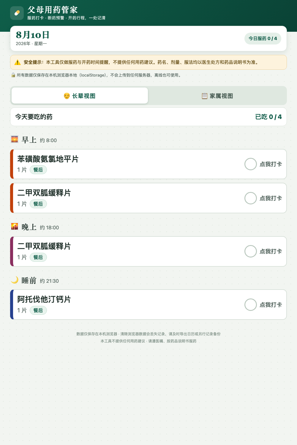 | Revision (single accent color + solid background) 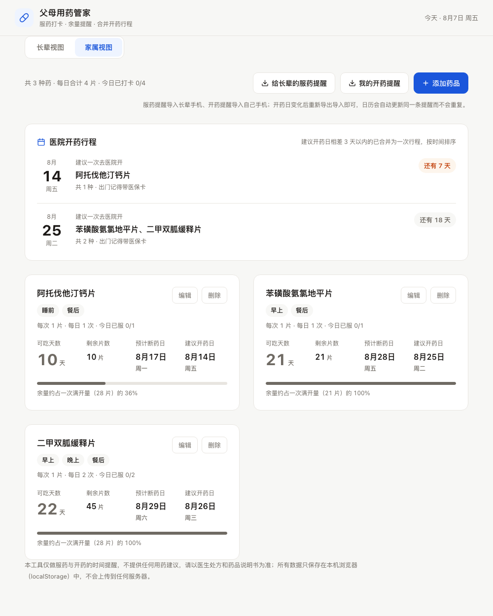 |
Steps: Four-dimension UI review
Send the UI screenshot along with the instruction below to qwen3.7-plus:
View actual output · UI review report (qwen3.7-plus visual understanding)
View actual output · UI review report (qwen3.7-plus visual understanding)
Notes
- Consumption: This playbook involves visual understanding (
qwen3.7-plus) single-image review. The screenshot itself is converted into image_tokens and counted toward input, taking up the vast majority of the input side; the text prompt is only a small fraction. The larger and clearer the screenshot, the higher the input consumption — a normal webpage screenshot size is enough for UI review; no need to use oversized images. - How to use its output: It's great as a bug-hunting lead — an out-of-place background, a scene-stealing alert box, or harsh colors are exactly the kinds of problems you go numb to after staring too long, and it picks them out at a glance.
- But don't treat it as an acceptance report: In testing, it can misread details that require precise counting (e.g., calling seven or eight colors "within 5," or missing a serif font), and it may misread the meaning of data on the page. Still confirm each suggestion against the actual UI.
- A cheaper approach: Write the color, font, and hierarchy requirements into the prompt up front (see the "Parents' Medication Manager" card) to save a lot of rework.